I worked with engineers, a design manager, a PM and others on Keepsafe VPN. My role was to design a user-friendly experience for technical and non-technical users.
- Skills: UX, UI, Mobile Design, User Research
- Tools: Sketch, Zeplin, After Effects
Research goals
I wanted to emphasize testing for usability. I also wanted to find out what users would most likely use the product for. Keepsafe VPN is part of a suite of privacy products. Keepsafe Photovault is the original core product. As such Keepsafe VPN was largely targeted towards previously existing users on Photovault. Those users represent a large range of technical knowledge. However, most were not particularly tech savvy.
A few insights
I did interviews with Keepsafe Photovault users who had said in a survey that they would be interested in a VPN product. Those users were largely interested in switching to an ad free VPN. They had already established trust with the Photovault app and had in several cases been users for over a year.
I did usability testing both in-person and via usertesting.com. The auto-connect feature took the most time for users to understand. Some users were confused about how to tell if their VPN was on when they were outside of the app. It wasn't clear to them when their browsing was protected.
For the most part users would use the VPN to access restricted content. They would most likely use it for browsing when they were not at home or work. Some would use it for browsing when they were at school. Many noted that they appreciated the private nature of the VPN but had not developed many security habits outside of using private browsing mode.
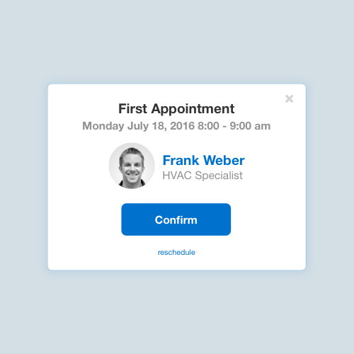
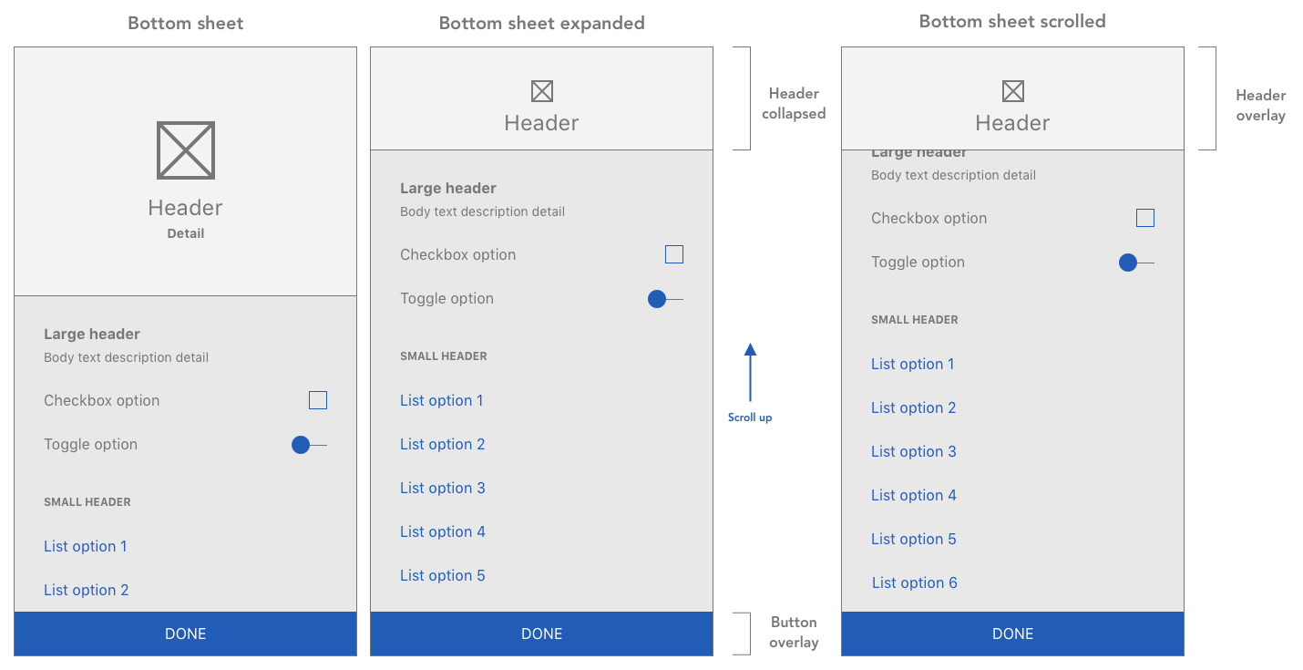
Onboarding
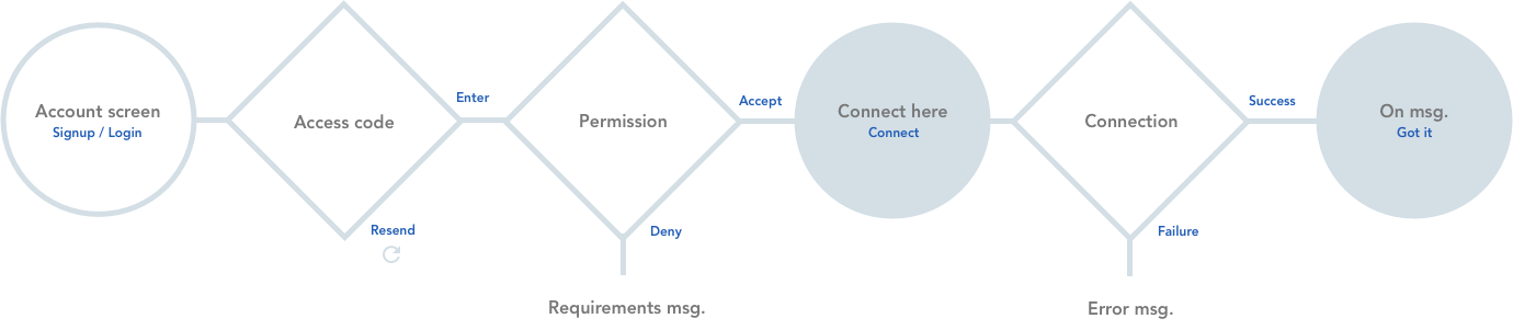
This was an area where thinking conceptually via a flow chart was especially helpful. It helped to account for the various states that would need to be considered. It was also a helpful conversation piece. We spent some time for instance discussing when it was most optimal to request permissions.
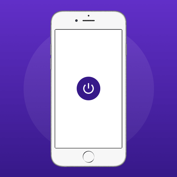
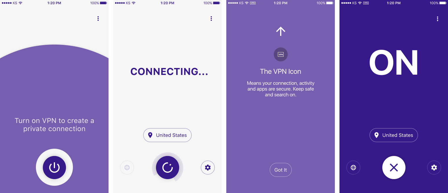
During user research I learned that users would sometimes struggle to tell when their VPN was turned on and working when they were outside of the app. The above shows a screen where we tell the user to check their status bar for the VPN icon. An entire screen was devoted to this to intentionally add some friction.
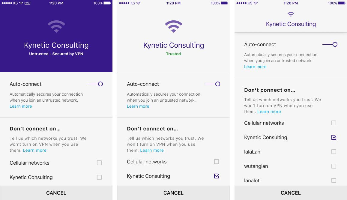
Auto-connect
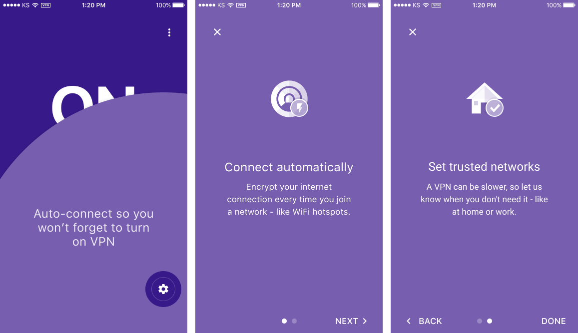
The auto-connect feature took a bit more time for non technical users to understand. Although this feature isn't uncommon for mobile VPNs it often isn't highly surfaced. This is probably due to its being most useful for the browsing use case. We wanted to make sure that our users would understand the feature as much as possible.
It's easy to use a VPN once and forget about it. Or to use it rarely. So I designed onboarding just for this feature. As part of the onboarding I used methods to explain trusted networks that users had themselves used during user testing. For example, many users told us that they would not want the VPN to be on when they were at home or work.
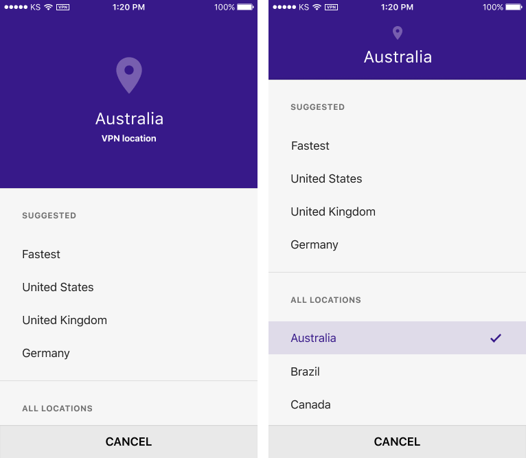
Location
Outside of the manual connection button the location button would be the most commonly used function. For the most part the major goal was to present relevant options in the most prominent position possible.
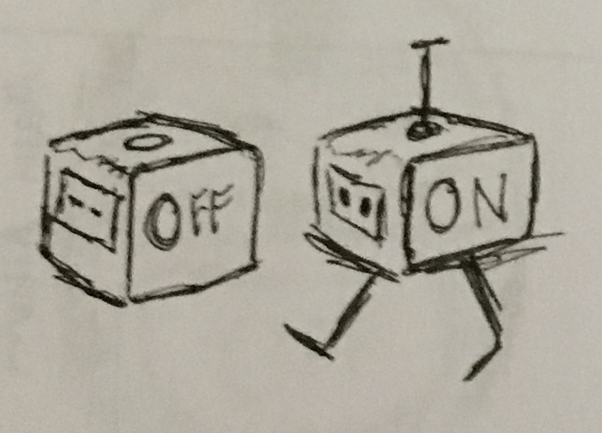
Connection
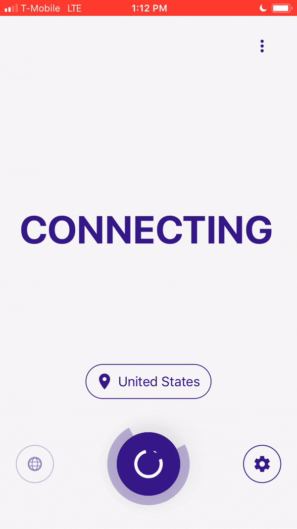
The rotating power button was made in After Effects. Using a plugin called Bodymovin to export JSON files which were given to the engineers who used Lottie to render. It is meant to appear to be "winding up" a connection. It uses a standard semi circle to indicate indeterminate progress.
UI
Many of our most promising users were interested in our VPN due to there being no ads. In addition, we wanted to communicate to as many people as possible, as quickly as possible. I created an unclutered, utilitarian interface.
I designed our app to be thumb friendly. All of the core features are within reach. I used bottom sheets which are a great method for lowering options on the screen. They are also scrollable, which makes it easy for the user to scan quickly.
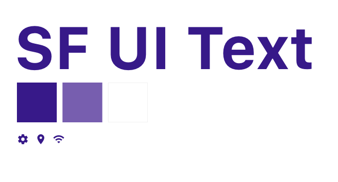
Choosing system fonts meant that our type would always be optimized for display no matter the screen. Material icons require little guesswork in their symbolism. They are also highly consistent in their construction. I used the dark Keepsafe purple both for branding and to suggest privacy. It is reminiscent of the dark ui seen in private browsing modes. I used a lavendar purple for its similarity to the Keepsafe purple. It also provided enough contrast on both white and the brand purple.
Sketches
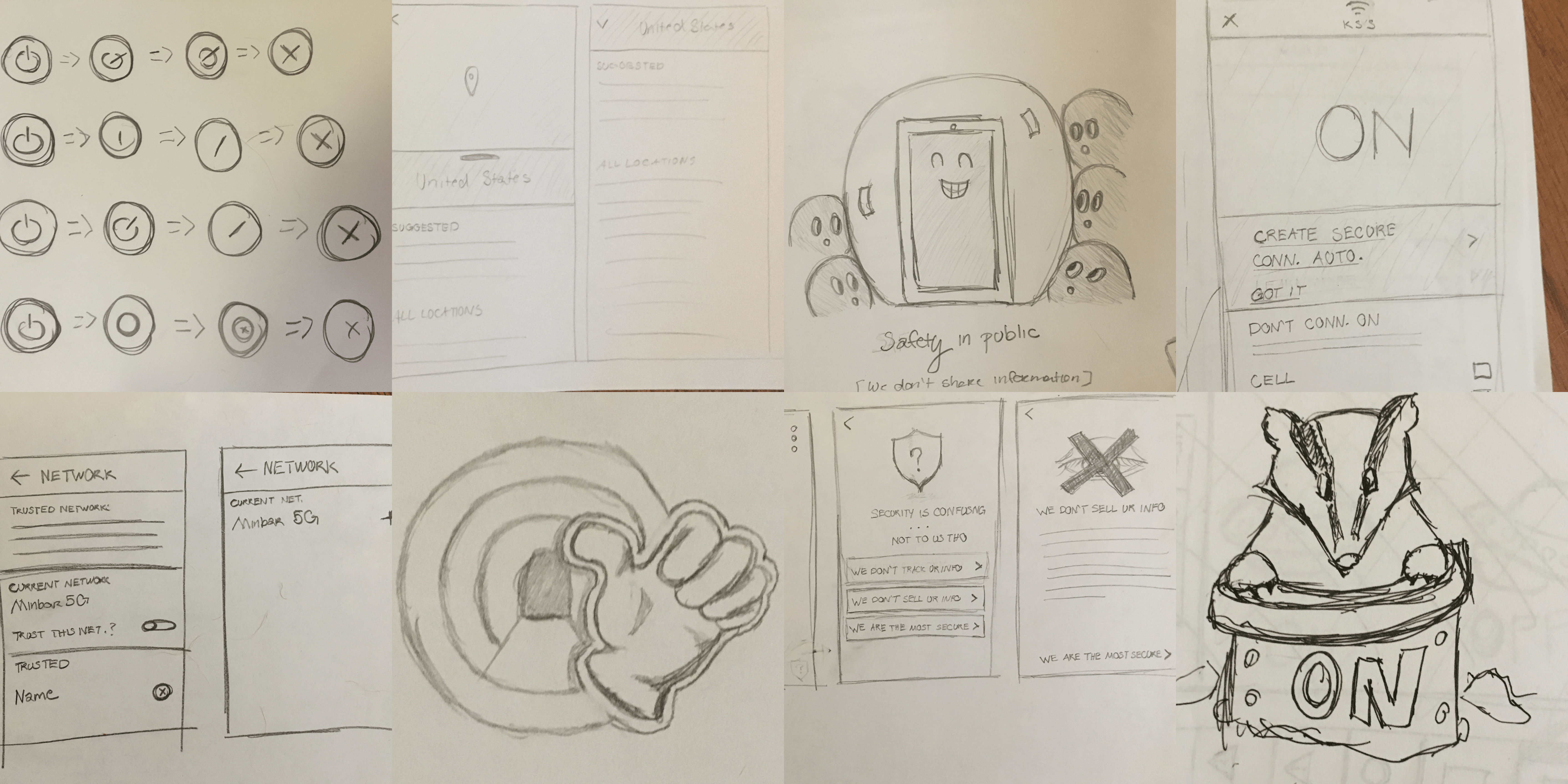
Throughout the project I amassed a large quantity of rough wires and explorations. I tend to start projects with sketches. Sometimes I will tidy up a few to show to others. Often I use them to help formulate ideas. They can help contribute to many stages of a project.
Conclusion
I'm happy to say that refining the product via user testing resulted in a very easy to use product. It's strongly utilitarian and gets out of the way quickly so that users can focus on browsing. The ease of use and the auto connect feature in particular also help users develop stronger security practices.